
IT’S LONG, BUT IT SHOWS JUST HOW THE RIGGED ELECTRONIC VOTING SYSTEM IN THE SWING STATES ONLY, FLAT-OUT FORCED A SODDAM HUSSEIN / NORTH KOREAN BIDEN WIN.
YOU KNOW YOU’RE ABSOLUTELY RIGHT AND THAT TRUMP AND HIS LEGAL TEAM ARE DIRECTLY OVER THE TARGET WHEN THIS ARTICLE HAS THE MEDIA JUST LOSING ITS COLLECTIVE MIND.
IF YOU WANT TRUMP BACK AND THIS FUCKIN’ BULLSHIT CRIME TO STOP WITH THE SWAMP, READ AND GET THIS ARTICLE OUT AND SEND IT TO YOUR REPS AND SENATORS. IT IS ALL RIGHT HERE IN FACTUAL BLACK AND WHITE. PLAIN AND SIMPLE. PERIOD!
Anomalies in Vote Counts and Their Effects on Election 2020
A Quantitative Analysis of Decisive Vote Updates in Michigan, Wisconsin, and Georgia on and after Election Night
Executive Summary
In the early hours of November 4th, 2020, Democratic candidate Joe Biden received several major “vote spikes” that substantially — and decisively — improved his electoral position in Michigan, Wisconsin, and Georgia. Much skepticism and uncertainty surrounds these “vote spikes.” Critics point to suspicious vote counting practices, extreme differences between the two major candidates’ vote counts, and the timing of the vote updates, among other factors, to cast doubt on the legitimacy of some of these spikes. While data analysis cannot on its own demonstrate fraud or systemic issues, it can point us to statistically anomalous cases that invite further scrutiny.
This is one such case: Our analysis finds that a few key vote updates in competitive states were unusually large in size and had an unusually high Biden-to-Trump ratio. We demonstrate the results differ enough from expected results to be cause for concern.
With this report, we rely only on publicly available data from the New York Times to identify and analyze statistical anomalies in key states. Looking at 8,954 individual vote updates (differences in vote totals for each candidate between successive changes to the running vote totals, colloquially also referred to as “dumps” or “batches”), we discover a remarkably consistent mathematical property: there is a clear inverse relationship between difference in candidates’ vote counts and and the ratio of the vote counts. (In other words, it’s not surprising to see vote updates with large margins, and it’s not surprising to see vote updates with very large ratios of support between the candidates, but it is surprising to see vote updates which are both).
The significance of this property will be further explained in later sections of this report. Nearly every vote update, across states of all sizes and political leanings follow this statistical pattern. A very small number, however, are especially aberrant. Of the seven vote updates which follow the pattern the least, four individual vote updates — two in Michigan, one in Wisconsin, and one in Georgia — were particularly anomalous and influential with respect to this property and all occurred within the same five hour window.
In particular, we are able to quantify the extent of compliance with this property and discover that, of the 8,954 vote updates used in the analysis, these four decisive updates were the 1st, 2nd, 4th, and 7th most anomalous updates in the entire data set. Not only does each of these vote updates not follow the generally observed pattern, but the anomalous behavior of these updates is particularly extreme. That is, these vote updates are outliers of the outliers.
The four vote updates in question are:
- An update in Michigan listed as of 6:31AM Eastern Time on November 4th, 2020, which shows 141,258 votes for Joe Biden and 5,968 votes for Donald Trump
- An update in Wisconsin listed as 3:42AM Central Time on November 4th, 2020, which shows 143,379 votes for Joe Biden and 25,163 votes for Donald Trump
- A vote update in Georgia listed at 1:34AM Eastern Time on November 4th, 2020, which shows 136,155 votes for Joe Biden and 29,115 votes for Donald Trump
- An update in Michigan listed as of 3:50AM Eastern Time on November 4th, 2020, which shows 54,497 votes for Joe Biden and 4,718 votes for Donald Trump
This report predicts what these vote updates would have looked like, had they followed the same pattern as the vast majority of the 8,950 others. We find that the extents of the respective anomalies here are more than the margin of victory in all three states — Michigan, Wisconsin, and Georgia — which collectively represent forty-two electoral votes.
Extensive mathematical detail is provided and the data and the code (for the data-curation, data transformation, plotting, and modeling) are all attached in the appendix to this document[1].
Background
Late on Election Night 2020, President Donald J. Trump had a lead of around 100,000 votes in Wisconsin, a lead of around 300,000 votes in Michigan, and a lead of around 700,000 votes in Pennsylvania. Back-of-the-envelope calculations showed that in order to overtake President Trump, Joe Biden would have to substantially improve his performance in the remaining precincts — many of which were in heavily blue areas like Detroit, Milwaukee, and Philadelphia.
On Election Night, conflicting news reports came in that various precincts were stopping their count for the evening, sending election officials home, or re-starting their counts. There remains a large amount of confusion to this day about the extent to which various precincts stopped counting, as well as the extent to which any state election laws or rules were broken by sending election officials home prematurely. Whatever the case is, various precincts in Wisconsin, Michigan, and Pennsylvania continued to report numbers throughout the night.
By the early hours of the following morning, Wisconsin had flipped blue, as did Michigan soon after. A few days later, Georgia and Pennsylvania followed suit. Given the uncertain context, many American observers and commentators were immediately uncomfortable or skeptical of these trends.
For context, using publicly available data from the New York Times, here is a visualization of the number of votes by candidate in Michigan from the beginning of election night to 7pm Eastern Standard Time (EST) on November 4th, 2020:
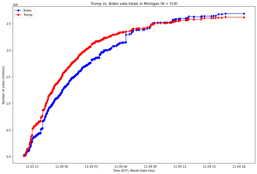
Fig. 1. X-axis is the Month-Year Hour of the time, Y-axis is the number of votes as of that time, expressed in millions of votes. The red series is the running number of votes for Donald Trump, and the blue series the running number of votes for Joe Biden.
As this graph shows, Joe Biden overtook President Trump’s lead through a small number of vote updates which broke overwhelmingly for Biden in Michigan in the early hours of the morning of November 4th.
The situation in Wisconsin is even more stark: a single update to the vote count brought Biden from trailing by over 100,000 votes into the lead. Here is the comparable graph, over the same time range, for Wisconsin, with the x-axis (time) expressed in Central Standard Time (CST):
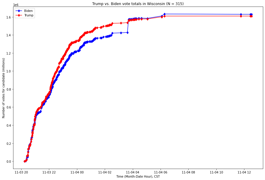
Fig. 2. X-axis is the Month-Year Hour of the time, Y-axis is the number of votes as of that time, expressed in millions of votes. The red series is the running number of votes for Donald Trump, and the blue series the running number of votes for Joe Biden.
Various versions of these graphs spurred online discourse. While some commentators provided relatively partisan analysis, others merely expressed surprise at the near-vertical leaps in some of these vote updates. Is it likely this phenomenon would arise organically? In an attempt to address this question, this report assesses how extreme and unusual these spikes are with respect to both other vote updates in the states of Michigan, Wisconsin, and Georgia, as well as those around the nation.
Through several investigative mechanisms, we find these four vote updates to be extraordinarily anomalous. While these alone do not prove the existence of fraud or systemic issue, it invites further scrutiny.
The Concept, the Intuition, and the Measurement
Data analysis relies on recognizing and evaluating patterns in data. When we find anomalous data, that is often an indication of underlying differences. This is why in this report we focus on these four vote updates.
There are also a number of general intuitions upon which we draw to direct our research. In general, the larger the sample size, the smaller we expect the deviation from the population average to be. While anomalous vote ratios may occur, the statistical chance of anomalous margins goes down as the size of the sample (or vote update) goes up.
The basic intuition is: big margins are one thing, and so are super-skewed results, but it’s weird to have them both at the same time, as they generally become inversely related as either value increases.
We will demonstrate below that the data overwhelmingly follow this intuition, but that four key vote updates identified by this report cut against this intuition.
In particular, we will show the existence of a very strong inverse relationship within vote updates, across all states and times, between the difference of votes for Joe Biden and Donald Trump (often referred to as the “Biden-Trump margin”) and the the ratio of Joe Biden’s votes to Donald Trump’s votes (often referred to as the “Biden:Trump ratio”). As described in more detail in the next section, we take the natural logarithm of the ratios so that they are symmetric, i.e. so that we are not treating the two candidates differently when graphing and analyzing. These values are often referred to as “Biden:Trump log-ratio.” Since the logarithm is an order-preserving transformation — i.e. if x is bigger than y, then log(x) will be bigger than log(y), and vice versa — we sometimes use them interchangeably when precision is not required.
At any geographical level, we can test the assumption of an inverse relationship between vote update size and the extremity of the ratio between the candidates’ votes, and, as we will see here, the relationship is extremely strong. Across states red and blue, where turnout is high and low, there is an obvious inverse relationship between the two.
Measuring This Relationship Between The Candidate’s Margin and their Ratio
Let us now attempt to quantify the nature of the inverse relationship in the context of a particular state. First we take our data set of running vote totals[2] for each state, and, for each state, calculate the vote differential for each candidate between updates. This produces a sequence of vote differences, the sum of which, within any given state, is the total.
To begin, we consider each sequential update in the state of Michigan where the vote totals for both Trump and Biden are greater than zero[3]. For each of these, we compute two values:
- The difference between the number of votes for Biden and the number of votes for Trump — the “margin”
- The logarithm[4] of the ratio between the number of votes for Biden and the number of votes for Trump — the “log-ratio”
Note: both of these metrics are symmetrical. If we let f1 be the first metric and f2 the second, the reader will note that, for any positive numbers (X, Y):

And that:

In other words, given X for Biden and Y for Trump, either metric will produce a score which is the opposite of what it would produce if the update instead had Y votes for Biden and X for Trump. This property is extremely useful, and will come in handy during the statistical analysis.
Readers might ask: Why are you measuring the ratio? Why not measure the difference between the vote proportions (or, equivalently, their percentages). The answer to this lies in what we are looking for, i.e. evidence of fraud or foul play which manifests in extremely unusual outcomes. In particular, ratios are almost never used in expressing vote counts (one typically hears of percentages or, when a race is close, numbers) and so anyone committing fraud and looking to “cover their tracks” is more likely to be “gaming” the metrics they’re used to, and much more likely to leave tells in metrics they’re not considering.
This obscures critical differences between the two statistics.
- Ratios demonstrate an important property: the farther ahead a candidate is, the harder it is to move the next 1 percent ahead. They reflect the relative difficulty of each marginal vote as the pool of remaining votes decreases.As a candidate approaches 0% or 100% of the vote, the rates at which the ratio of that candidate’s votes to the other candidate’s votes converge to zero or infinity are very different.
- Ratios allow us to spot a potential sign of fraud: unusually low ratios between the losing (major) candidate and other, less well-known candidates. Because those who watch and participate in elections tend not to think in these terms, if there is fraud, they’re much less likely to have covered their tracks in this respect. A tin-pot-dictator style election where the favored candidate gets 99% of the vote is obviously suspect, but less attention is often paid to details like whether the ratio between the most popular losing candidate and long-shot third-party candidates actually makes sense[5]. Looking at metrics which are less popular in practical use will be tremendously helpful here, as we will see.
To illustrate this, let us consider a sequence of two hypothetical elections between Tom and Harry. Imagine that the first time around, Tom wins with 55% of the vote to Harry’s 45%. Four year later, Harry is the challenger and Tom improves his margin to 60% of the vote. There are many ways that this can happen; winning over new voters, Harry’s previous supporters no longer voting, Harry’s supporters switching to Tom, or some combination of any of the above. Let’s consider merely the last case for the moment. For Tom to get from 55% to 60%, he must convert one out of every nine, or just over 11%, of Harry’s supporters. This may not be easy, but is hardly outside the realm of possibility.
Now consider another hypothetical election in a heavily partisan electorate, between Alice and Bob. In the first election, Alice gets 90% and Bob gets 10%. In order for Alice to achieve the same absolute percentage increase as Tom, i.e. 5%, she must convert 5% among a population of 10%. In other words, she must convert one out of every two supporters of Bob. For reasons outside the scope of this paper, this may not be 4.5 times as difficult as a candidate getting from 55% to 60% of the total vote, but it is without question much harder. A useful example of this is this is San Francisco, CA, which, despite being one of the bluest cities in America numerically and culturally, is one where Democratic Presidential candidates consistently get about 90% of the vote but never seem to crack 95%. There are Republicans in San Francisco, however few of them, and converting half of them is a tall order. This makes ratios a useful tool in our arsenal for answering questions of the form “how much is too much”?. This allows us to assess the data in a way which we believe is qualitatively different — and qualitatively superior — to the common forms of assessment used by average individuals and the news media.
This election represents an extraordinary and unique opportunity for election integrity analysts and the application of statistical fraud detection research, as it is likely the first national election in American history, at the very least, where the general public has had access to time-series election data. Even well-respected academic papers which study election fraud in other countries[6] seem to mostly study after-the-fact information about final tallies; analysis is done on statistics about voter turnout, digit frequencies, and other information which is available in after-the-fact official numbers. After all, if reports of widespread fraud and corruption ordered from the top in elections in, e.g., Russia, Uganda, Ukraine, Iran, etc., are to be believed, then those governments, which tend to have much more control over what can and cannot be published than our government, are unlikely to want to increase the number of dimensions along which their claim to legitimacy can be audited.
A Look at Michigan
Let us now calculate these two values for each vote update in Michigan where both Biden and Trump have positive values. If it follows the intuition that there as an inverse relationship between the margins of an update and its ratio, we should expect to see a large cluster of data with a few points above, below, to the left and right, and virtually no points in either the top right (which would represent a simultaneously extreme Biden-Trump margin and Biden:Trump ratio) or the bottom left (which is analogous but favorable to Trump).
Here is that distribution, presented as a scatter plot, with the numerical margins as the X-axis and the log-ratios as the Y-axis.
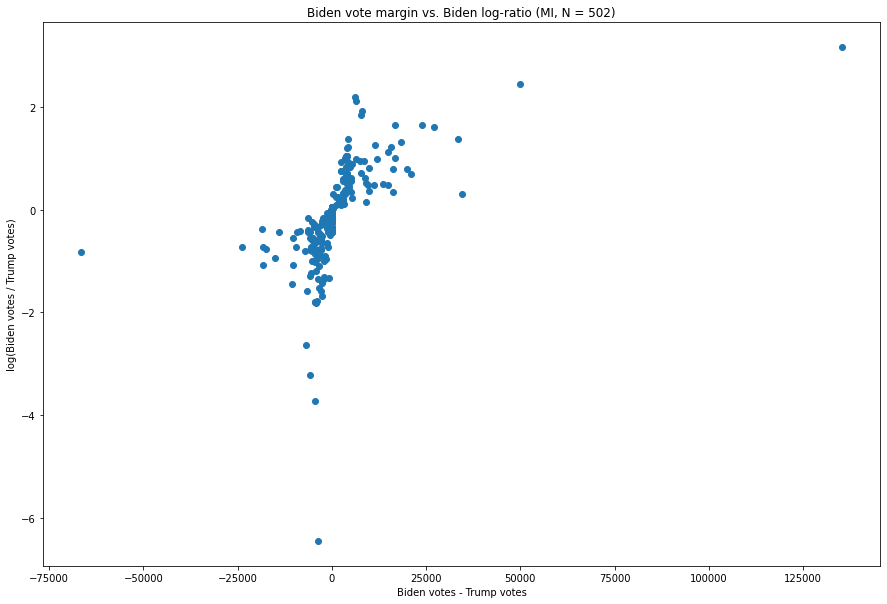
Fig. 3. The X-axis is the difference between the number of Biden votes and the number of Trump votes in each vote update, and the Y-axis is the natural logarithm of the ratio of the two.
As we can see, most observations follow the basic contour of our hypothesis, i.e. the more extreme an update is in one respect, the less extreme it is in another.
For example, the update at (-3,622, -6.449), has a fairly extreme ratio of Biden:Trump votes — about 1:632 — but is not very large, producing only a margin of -3,622 votes for Biden, which, as we can see, is not terribly extreme in the context of this distribution. Similarly, the point all the way to the left, (-66,456, -0.816), is one where Biden’s margin is a significant -66,546, but where the ratio, of about 1:2.26, is not particularly unusual for a vote update which favors Trump.
We can see this pattern as well in almost every Biden-favoring update as well. For example, the update with the 3rd greatest margin for Biden, at (34,450, 0.296), is 134,326 Biden votes to 99,867 Trump votes, and only has a Biden:Trump ratio of 1.34:1. And the update with the 3rd greatest Biden:Trump ratio, at (6,091, 2.184), in which Biden received 6,863 votes and Trump received 773 votes, has a fairly extreme ratio of 8.884 but only nets Biden 6,091 votes, a relatively small amount compared to what we will examine next.
Two points stand out.
Let us first consider the less extreme of these, i.e. the point at (49,779, 2.447). This point, representing a vote update which went 54,497 for Biden and 4,718 for Trump and arrived at 3:50am ET on November 4th 2020, is both the second-largest vote margin of Biden’s, at 49,779, and also has the second largest Biden:Trump ratio at 11.55:1. As we can see and as was described above, the update with the next largest margin was an update with merely 7,776 votes, while this update had over 7 times as many votes and broke more heavily for Biden.
The oddness of the update described above pales in comparison to that of the update in the top right corner, however. That update, at (135,290, 3.164), represents the vote update described at the top of this report, and is responsible for the extremely noticeable spike which nearly eliminated Trump’s lead in one shot. It arrived at 6:31am ET on November 4th, and went 141,258 for Biden to 5,968 for Trump — representing both the largest vote margin for Biden of any of the 502 updates we have here, at 135,290, while also representing, by a factor of more than 2, the largest Biden:Trump ratio, at a whopping 23.67:1 (the log of which is 3.16). As we will see when comparing with other states, by our metric this is the single most anomalous point in the nation.
This update is also particularly interesting for another reason: there are 2,546 non-two-party votes, while Donald Trump only has 5,968. Here is a histogram of vote-total-weighted Other:Trump ratios[7]:
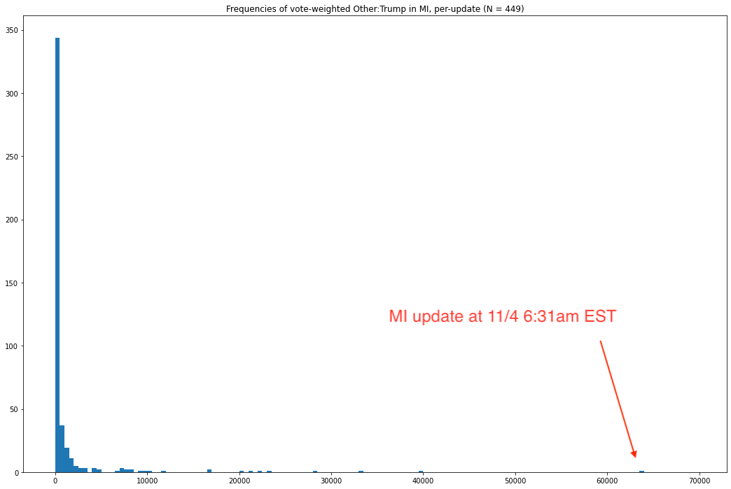
Fig. 4. The x-axis is, for each vote update, the ratio of other (non-2-party) votes to votes for Trump, multiplied by the number of total votes in that update. The y-axis is the number of vote updates in that “bin,” where each bin has a range of 500.
As we see, when we weight by the number of votes in any given update, this update is particularly anomalous. The next closest vote-weighted Other:Trump ratio is less than two-thirds of this one, and the median — 137.56 — is smaller by a factor of about 464.5. For such a large batch of votes to be counted while also showing such an exceptionally poor performance of Trump relative to the non-two-party vote is clearly very surprising.
In particular, it calls into serious question the veracity of this vote update, and is perhaps some of the strongest direct evidence of fraud in this entire report. Someone looking to fraudulently improve Joe Biden’s margins relative to Donald Trump is likely to be focused on covering their tracks by keeping Joe Biden’s share of the update at a reasonable value. 95% might seem plausible, but 99.9% at this scale becomes prima facie implausible to any honest observer. One effective way of achieving the desired goal of decreasing Donald Trump’s lead at this point would have been to suppress the Trump vote while artificially inflating the non-two-party vote in an attempt to disguise just how Biden-favoring this update actually was. Indeed, this is precisely the reason this report uses ratios — because they are a metric virtually never used for any practical purpose in discussing election results, someone committing fraud is far less likely to consider how unusual a ratio might look. In particular, because the non-two-party candidates received far less media attention than in the 2016 Presidential election, and the Green Party candidate was even successfully sued off of the ballot in one or more states, it is hard to believe that this vote update only favored Trump over the non-two-party vote by less than a factor of 2.5, when the statewide ratio was over 31[8].
Absent a compelling explanation of why this particular update — at such a crucial time, in a crucial state, which improved Biden’s standing in the state so dramatically — also had non-two-party votes performing so unusually relative to Trump votes, it seems unlikely that this vote update reflects an honest accounting of the legitimate votes.
Subsequent sections of this report quantify how extreme it is in other respects and consider the implications if it had been slightly less extreme.
A Look at Wisconsin
Here is the analogous graph for Wisconsin.
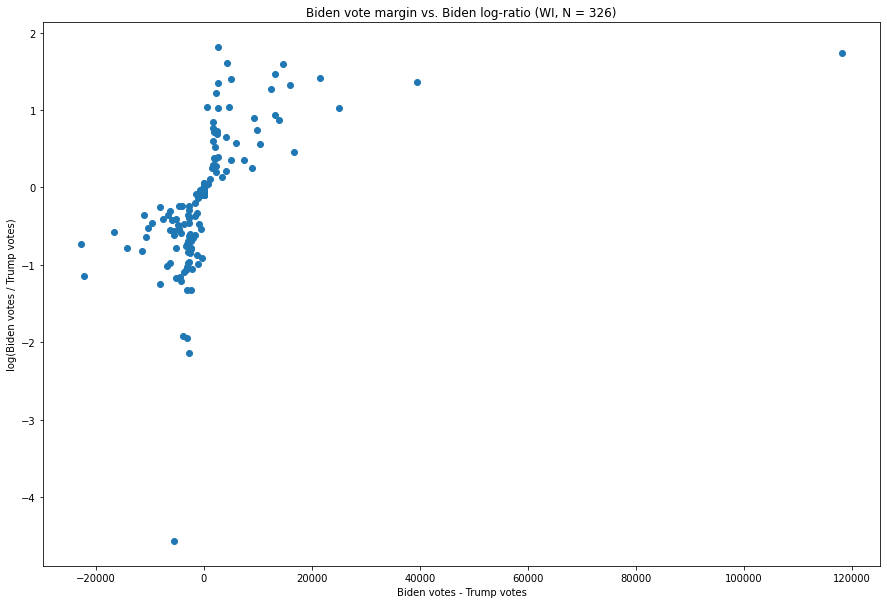
Fig. 5. The X-axis is the difference between the number of Biden votes and the number of Trump votes in each vote update, and the Y-axis is the natural logarithm of the ratio of the two.
The patterns in this graph are somewhat more bizarre. The updates favoring Trump (i.e. those to the left of zero on the x-axis) exhibit an inverse relationship between the margin of victory in a Trump-favoring update and the ratio between Trump and Biden votes. For example, the update at, (-5,433, -4.564), which is the most extreme in the state in terms of ratio, is from an unusually Trump-favoring batch of ballots which went 5,490 for Trump to 57 for Biden, i.e. a Trump:Biden ratio of about 96:1 for Trump. This number itself is quite large, but, critically, it is not anomalous with respect to the shape of the distribution. The tell-tale sign of oddity here is not extremity with respect to either value, but co-extremity.
Biden’s distribution looks slightly odd here, but there is one point which especially stands out, i.e. the one in the top right, at (118,215, 1.74). This was the vote update which arrived at 3:42am CST on November 4th, and went 143,379 for Biden to 25,163 for Trump[9], giving a margin of 118,215 and a Biden:Trump ratio of about 5.7:1 — about 3 times larger than the update with the next largest margin (which was 39,499). At the same time, only one update — one with a mere 6,435 votes (i.e. about a factor of 18 fewer than the update in question) which went 3,037 for Biden to 495 for Trump — has a larger ratio, at around 6.14:1.
A Look at Georgia:
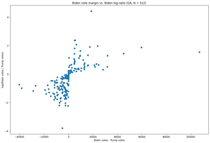
Fig. 6. The X-axis is the difference between the number of Biden votes and the number of Trump votes in each vote update, and the Y-axis is the natural logarithm of the ratio of the two.
This one seems only slightly more anomalous than other such graphs, but, as we will see, actually contains two of the nine most anomalous vote updates in our combined distribution of 8.954 vote updates. In particular, the point at (136,155, 1.543), representing a vote update which arrived at 1:34am EST on November 4th, is the update with the largest margin of all of the updates in Georgia — it also has the 10th largest Biden:Trump ratio. There are a few smaller updates with more extreme ratios, but, as we will detail later in this report, this point is in fact unusual.
A Short Survey of Other States
We now turn to other states, particularly those with similar characteristics (e.g. a swing or blue state where one or two urban cores offsets an otherwise very Republican population). These help us establish an initial baseline of what these distributions should look like within any state before we begin comparing updates directly across states.
Pennsylvania:
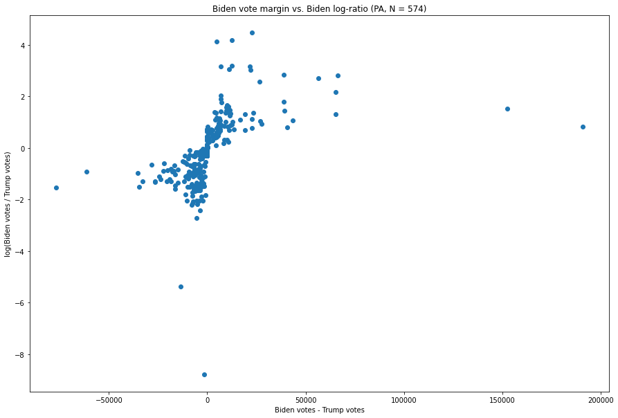
Fig. 7. The X-axis is the difference between the number of Biden votes and the number of Trump votes in each vote update, and the Y-axis is the natural logarithm of the ratio of the two.
The inverse relationship is immediately visible here. We have points near the bottom (representing high Trump:Biden vote ratios), a few points far to the left (representing high Trump – Biden values), and a couple (much farther) off to the right, representing a high Biden-Trump margin, but which are not particularly extreme in terms of their Biden:Trump ratio.
Minnesota:
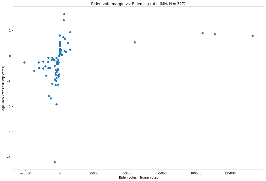
Fig. 8. The X-axis is the difference between the number of Biden votes and the number of Trump votes in each vote update, and the Y-axis is the natural logarithm of the ratio of the two.
While there is an update which is more extreme in terms of how large the Trump:Biden ratio is, and several updates with extremely large Trump-Biden margins, we see the basic shape remains the same.
New York:
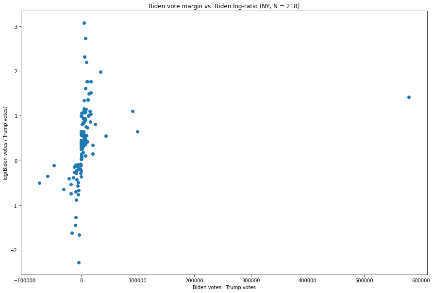
Fig. 9. The X-axis is the difference between the number of Biden votes and the number of Trump votes in each vote update, and the Y-axis is the natural logarithm of the ratio of the two.
The vote margins for each update are clustered fairly heavily around zero, while the few updates which have exceptionally large margins for either candidate have ratios which are not nearly as extreme as those of many other updates.
Consolidating, Comparing, and Measuring
Having taken a brief tour of states with similar characteristics, i.e. where Joe Biden is currently in the lead and the Democratic vote comes overwhelmingly from a single urban area (or perhaps two, in the case of Pennsylvania), we can see that the Michigan and Wisconsin graphs both look unusual. In order to more rigorously assess the extent to which this is actually anomalous, it is necessary to accommodate the reality that the typical Biden-Trump margin and Biden:Trump ratio will vary substantially between states. If we merely take these values as they are, then most of the differences between, e.g., Alabama and California would likely just be artifacts of the massive discrepancies between how the candidates each performed in these states.
To achieve this, we can use a data transformation process called standardization. This is a process by which, for a series of numerical data, the mean of the data is subtracted from each point, and then the result is divided by the standard deviation. This will produce a series of distributions which permit an apples-to-apples comparison of these values (i.e. per-vote-update Biden-Trump margin and Biden:Trump log-ratio) between states which are both very different in size and lean very differently, politically. Data standardization is a very common technique in machine learning for training models on data sets with very different numerical magnitudes and means[10], as it provides precisely the functionality we need here.
We can thus standardize each individual (margin, log-ratio) point within its state[11], and plot it as we did before. Here is what that graph looks like. The values for Michigan are in red, those for Wisconsin are green, and the values for all other states are blue:
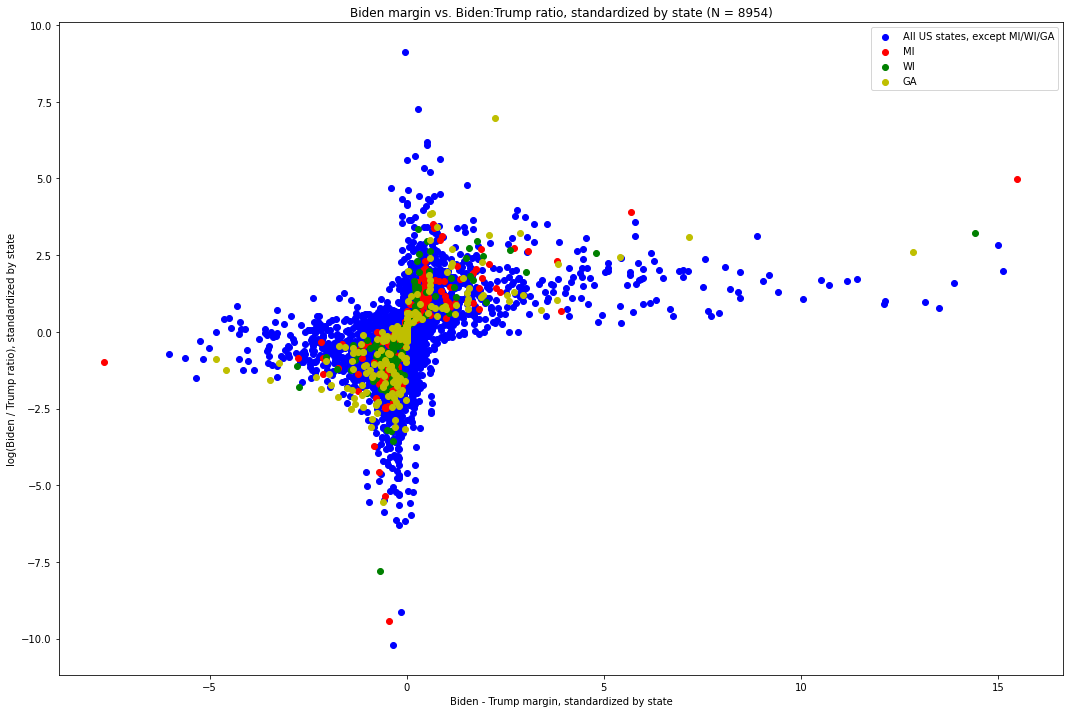
Fig. 10. The X-axis is the difference between the number of Biden votes and the number of Trump votes in each update, standardized by the distribution of such values of its state. The Y-axis is the log-ratio of Biden votes to Trump votes in each update, again standardized by the distribution of such values in its state.
Out of these 8,954 vote updates across the country, we can see how overwhelming the pattern is. In particular, we see that — with a few notable exceptions — as one value grows more extreme in any direction, the other tends to become less extreme.
This brings us to the visually identifiable exceptions.
Directing our attention to the points on the far right end of the distribution, i.e. those which have the most extreme Biden-Trump margin with respect to their state, we immediately see one point from Michigan, which is quite far above where the shape of the plot would otherwise predict it being. This, the point at (15.494, 4.989), is the vote update which arrived at 6:31am EST on November 4th, went 141,257 to Biden and 5,968 to Trump. Recall: this update had both the largest margin (135,290) of any of the 574 updates[12] in Michigan, by about 85,000 votes and a factor of about 2.7 over that of the update with the next-largest update, (5.679, 3.912) — which, critically (and surprisingly, vis a vis what this distribution shows), was both the second largest in terms of Biden-Trump margin and Biden:Trump ratio[13]. It also had the largest Biden:Trump ratio (roughly 23.69:1), by more than a factor of 2 over that of the update with the next-largest Biden:Trump ratio. The visual discrepancy between that update and the overwhelming pattern followed by the other updates is glaring, and we will shortly quantify just how extreme it is.
Next, consider the green dot just slightly down and to the left of the red outlier. This is the vote update in Wisconsin which arrived at 3:42am CST on November 4th, which went 143,379 for Biden and 25,163 for Trump, for a margin of 118,215[14]. It was the update with the largest Biden – Trump margin in Wisconsin by a large distance[15] and, in Biden:Trump ratio, was second largest — second only to an update which was 26 times smaller and yet only slightly more extreme in its ratio[16].
We also see a red dot at (5.679, 3.912), which corresponds to the vote update which arrived at 3:50am EST on November 4th and went 54,497 for Biden to 4,718 for Trump, for a margin of 49,779 and a ratio of 11.55:1. It is worth noting that, while not nearly as anomalous as the 6:31am EST update, this one was very extreme along both dimensions in its own right. As we will see, however, it ends up being the seventh most extreme value in terms of its non-adherence with the distribution as a whole.
While both of these points would be unusual on their own, it is exceptionally unlikely that both of them would have come from the same state, critical to the election, less than three hours apart during an overnight counting process — a process subject to great controversy and where there remain, nearly three weeks from election day, many unknowns. Together, these two vote updates provided Joe Biden with the votes required to deliver him the lead in the state.
Quantifying the Extremity
Having demonstrated visually how anomalous the four key vote updates are, we can now proceed to attempt to quantify how unusual it is that these three points exist at once and that two of them are from the same state.
The below graph has two particularly interesting visual properties:
- The graph is presented two-dimensionally, but it’s really three-dimensional. It’s visibly much denser in the center, has what appear to be something like two normal distributions, and as you move farther from the origin along a positive-sloping line which runs through the origin, the lower the density you can expect.
- The outer “edges” of the graph, in the top-right and bottom-left quadrants, closely resemble the shape of the line y = 1 / x.
We similarly expect points to be in both the top-right and bottom-left quadrants, and between an outer line which has the shape of y = 1 / x and the origin. Since these values will thus mostly be either both negative or both positive, we can see that multiplying each point’s x-coordinate with its y-coordinate is a useful way of assessing the extent to which it follows this sort of distribution. Since there are more points near the origin than there are on the visible “boundary lines” (i.e. the sequences of points on the outer edges in the first and third quadrants which visibly form these lines which look like a graph, if perhaps scaled, of y = 1/x).
We thus, for each (again, both standardized by state) coordinate pair of Biden-Trump margin and the log-ratio of Biden to Trump votes, can multiply these values and examine the distribution of the resulting products. Here, the larger a value is in magnitude, the less it follows the non-co-extremity. Plotting these products gives us:
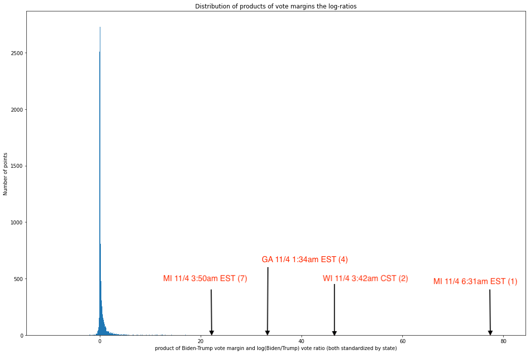
Fig. 11. Histogram of products of x and y values for each coordinate pair in Fig. 10
As we can see, the values are overwhelmingly concentrated near the median, and the graph is profoundly right-skewed — otherwise, the x-axis would not need to stretch all the way to 80. All but 60 out of 8,954 unique updates have values less than 10, and all but 10 have values less than 20. In other words, an overwhelming share of updates seem to track this rule pretty closely, but a small number of updates are truly extreme outliers.
A quick dive into these ten points reveals data which, by this point in the report, will be very familiar to the reader:
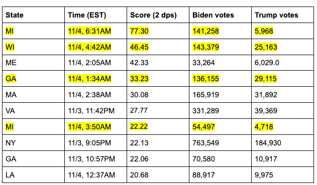
As we can see, four of the seven most anomalous vote updates — which is to say, updates in which the margin and ratio are co-extreme — are in election-critical states and occurred during the same five hour period where the circumstances on the ground were (and remain) contested and highly suspicious.
It is worth noting here that roughly 15% of the vote updates in the data set of 8,954 were from these three states. If we assumed it equally likely that any particular state should end up at any of these extreme points, there would be about a 1.2% chance that three states are represented in three out of the top four or four out of the top seven spots, and about a 0.99% chance that these three states would occupy five out of the top seven spots. It is thus very surprising to see the states in question be so disproportionately represented in the top 0.11% of the distribution of co-extremity[17].
Predicting More Typical Results and Assessing Their Implications
We now proceed to ask: How extreme did these vote updates need to be for Biden to win these states?
To do this, we consider “level sets”[18] of the products of the x and y values of the coordinates we are plotting, and consider the percentiles of these (with respect to the values graphed in Fig. 10). Each level set is a point in that distribution, and has a corresponding percentile. For example, the 99th percentile of products is about 6.6 — much smaller than the values of 77.30, 46.45, 33.23, and 22.22 which we see for these four updates. We can now determine what each of these updates might have looked like if they were only at the 99th (or other) percentile of co-extremity. In deciding how to do that, we must consider — what makes more sense? Holding the margin constant and seeing what the ratio would look like, or holding the ratio constant and seeing what the margin would look like? The latter makes far more sense in this scenario, since the former suggests an equal number of ballots for both candidates may have been held back improperly, while the latter likely suggests that an excess number of ballots for the winning candidate were produced. We are interested in testing for the latter scenario.
Since we are using ratios to predict margins, it makes sense to show what the graph in Fig.10 looks like when the axes are reversed, so that one can see how the margins vary with the ratio.
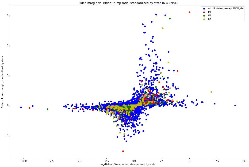
Fig. 12. This is the same graph as Fig. 10, but with the axes flipped. The X-axis is the log-ratio of Biden votes to Trump votes in each update, again standardized by the distribution of such values in its state. The Y-axis is the difference between the number of Biden votes and the number of Trump votes in each update, standardized by the distribution of such values of its state.
This shows the same data as shown in Fig. 10, but is a more natural presentation for using ratios to predict margins. The pattern becomes somewhat more clear when we simply look at absolute values, as our subsequent examinations rely on metrics which treat pro-Biden and pro-Trump vote updates symmetrically.
We can also consider the “level set” of (margin, ratio) combinations which form a particular percentile of co-extremity. Here, we show the absolute values of the (standardized) log ratio and margin, with level-set annotations for the 95th, 99th, and 99.5th percentile:

Fig. 13. This is the same graph as Fig. 12, but where the absolute value of the coordinates of both points is taken first, so as to present a consolidated view. The x-axis is the absolute value of the (standardized) log-ratio of Biden:Trump votes in each update, and the y-axis is the absolute value of the (standardized) Biden-Trump margin in each update.
This allows us to clearly see how extreme vote updates are, with respect to the generally observed property of them being bounded by an inverse curve[19]. The solid black line represents the 95th percentile — i.e. 95% of vote updates are inside of this curve (i.e. have less co-extreme margins and ratios). The middle black line, with dashes and dots, represents the 99th percentile, i.e. 99% of the 8,954 vote updates are less co-extreme than any of the points on this line. And the highest-up line (dotted black), represents the 99.5th percentile, i.e. 99.5% of the 8,954 vote updates are less co-extreme than any of the points on this line. As we can see, all four of the vote updates in question (the two red points, the green points well above this line, and the farther-up yellow point), are well above even this line. Indeed, the least extreme of these points, represented by the lower red dot which is above the 99.5th percentile curve, is the 7th most co-extreme point out of all 8,954 vote updates, and represents the 99.92nd percentile.
This raises the obvious question: what might these vote updates look like if they were less extreme?
Graphically, this would involve moving them some combination of down (representing a lower margin) and to the left (representing a lower ratio). In theory, we would simply calculate the shortest distance to any particular percentile level-set curve and choose that particular (margin, ratio) combination. Doing so would ignore a crucial aspect of the nature of the data, however. In particular, decreasing the ratio at any given margin implies the total number of votes in the update would go up. In particular, given the scale of the anomalies here, this would imply a scenario in which a large number of votes — possibly hundreds of thousands — for both candidates were somehow withheld. While it is possible that this is the case, it would almost certainly represent a data-entry error on the scale of hundreds of thousands of votes which affected both candidates equally or nearly-equally. Since the margin is the metric which matters for the result, if there was foul play, it is much more likely that votes are being subtracted from one of the candidates while also added for another.
Since we bring no a priori assumption about what these updates should like, it is worth considering what they would look like if these ratios are accurate and they merely represented the 99th percentile of co-extremity. Graphically, this represents taking the four points in question and “dragging” them down to the middle of the three black lines plotted. If this were done, these vote updates would have staggeringly smaller margins but would still be more co-extreme than 99% of the 8,954 vote updates studied. We have no affirmative reason to believe that this was precisely the case. Indeed, we cannot, with the data available to us, affirmatively make a case for any particular outcome. It is merely useful to consider what updates with these ratios would have looked like if they were more co-extreme than only 99% of the 8,954 vote updates studied, as opposed to 99.92%.
If these results seem unrealistic or implausible, this is a result of how bizarre these vote updates are with respect to the rest of the distribution.
First, let us consider the MI update at 6:31AM EST on 11/4. Its product is 77.3, and its (margin, log-ratio) coordinate pair was (15.494, 4.989)[20]. If it were to only be at the 99th percentile of co-extremity, then its product would only be 6.600. So, if the (standardized) log-ratio value of 4.989 is held constant, the (standardized) margin value would be a mere 1.323, as opposed to 15.494.
At this point, we have to undo the standardization process which allows us to fairly compare values between states. Since these were standardized with respect to the vote updates in MI, we can determine the actual margin value corresponding to a z-score[21] of 1.323. Looking up the numerical margin which corresponds in Michigan to a z-score of 1.323[22], we see it is about 11,834, while the z-score of this actual observation was 15.494, corresponding to a margin of 135,424. In other words, if we hold the ratio constant, and this vote update were only at the 99th percentile of co-extremity, the margin in this vote update would have been 123,590 votes fewer.
Let us now consider the WI update at 3:42 AM CST on 11/4. Its product is 46.452 and its (margin, log-ratio) coordinate pair was (14.427, 3.220). If it were to only be at the 99th percentile of co-extremity, then its product would be 6.600. So, if the (standardized) log-ratio value of 3.220 is held constant, the (standardized) margin value would be only 2.050, as opposed to 14.427. Looking up the numerical margin which corresponds in Wisconsin to a z-score of 2.050[23], we see it is about 16,938, while the z-score of this actual observation was 14.427, corresponding to a margin of 118,396. In other words, if we hold the ratio constant, and this vote update were only at the 99th percentile of co-extremity, the margin in this vote update would have been 101,459 votes fewer.
Let us now consider the GA update at 1:34AM EST on 11/4. Its product is 33.233 and its (margin, log-ratio) coordinate pair was (12.836, 2.589). If it were to only be at the 99th percentile of co-extremity, then its product would be 6.600. So, if the (standardized) log-ratio value of 2.589 is held constant, the (standardized) margin value would be only 2.549, as opposed to 12.836. Looking up the numerical margin which corresponds in Georgia to a z-score of 2.549[24], we see it is about 21,250, while the z-score of this actual observation was 12.836, corresponding to a margin of 107,143. In other words, if we hold the ratio constant, and this vote update were only at the 99th percentile of co-extremity, the margin in this vote update would have been 85,892 votes fewer[25].
Lastly, let us consider the MI update at 3:50AM EST on 11/4. Its product is 22.219 and its (margin, log-ratio) coordinate pair was (5.679, 3.912) If it were to only be at the 99th percentile of co-extremity, then its product would be 6.600. So, if the (standardized) log-ratio value of 3.912 is held constant, the (standardized) margin value would be only 1.687, as opposed to 5.679. Looking up the numerical margin which corresponds in Michigan to a z-score of 1.687[26], we see it is about 15,009, while the z-score of this actual observation was 5.679, corresponding to a margin of about 49,8929. In other words, if we hold the ratio constant, and this vote update were only at the 99th percentile of co-extremity, the margin in this vote update would have been 34,819 votes fewer[27].
Putting this all together, we see that if all four of these vote updates were extreme — but not as extreme — that the difference in margin would be greater than the margin of victory in all three states.
At the very least, it is possible to definitively say that Joe Biden’s victory in all three of these states relied on four of the seven most co-extreme vote updates in the entire data set of 8,954 vote updates.
Important Considerations
It is important to note one crucial indicator of why these results are bizarre. In virtually all other cases, areas which are very pro-Biden or pro-Trump have vote updates of varying size, and so a large vote update heavily favoring one candidate is almost always accompanied by even smaller updates which have a higher variance in the ratio, and at least some of them will favor the candidate who won the largest batch.
In particular, to accept the results as seen in Michigan as legitimate, one would need to believe that the one or two most possible pro-Biden areas of the state were somehow each counted their ballots entirely in one or two vote updates. If they were counted incrementally and released in smaller batches, as is typically the case, we would expect to see smaller updates with higher variance in outcome, and would almost certainly see updates with a higher Biden:Trump ratio than the two Michigan updates discussed in this report.
Indeed, if it is subsequently discovered that these did not comprise the entire count (for either mail-in votes or all votes) in these areas, then these results should be regarded with extreme suspicion. While vote counts are by no means a random sample nationally, given a small enough sub-population at which votes are counted, they eventually are. If it can be shown by those with access to time-series county-level (or precinct-level) data that, for whichever counties or precincts reported in this update, that there were other updates (or other updates with mail-in ballots), then these results become almost impossible to believe. This is to say, the believability of these updates relies on the premise that the one or two most Biden-favoring parts of the state (perhaps by ballot type) were counted entirely in these two batches. If it cannot be shown that the ballots counted during these spikes were qualitatively different from all other vote updates in Michigan, then the results are likely too extreme along multiple dimensions to be accepted at face value.
One would also need to believe that mail-in ballots, which have generally been understood to be more pro-Biden, sometimes substantially so, were counted in their entirety in these regions. While this data set does not provide breakdowns of how many votes in each update came from different types of votes, it is extremely surprising that we do not see smaller vote updates with mail-in votes which favor Biden more heavily.
This is also the case in Wisconsin, there the update discussed in this report, which had the largest Biden margin by far, also had the second-highest Biden:Trump ratio, by only a small amount. Accepting this at face value requires the belief that the most pro-Biden subset of the votes — by geography and vote type — was counted entirely in one batch. It would be extremely surprising if all mail-in ballots in the two most favoring Biden counties in the state, Dane and Milwaukee County, were entirely contained in this batch, and so it raises the question as to why we didn’t see even more pro-Biden updates in smaller, higher-variance vote updates in these heavily Democratic areas. If we are to accept that these votes were counted entirely in one batch, this raises serious questions as well. In particular, given the ambiguity — to this day — about where the vote-tabulation process was stopped and why, it makes little sense why these votes would be released in such an unusually large batch.
All of this is especially surprising when viewed in contrast to the prevailing analysis of the election, i.e. that Joe Biden’s victory was the result of improved performance in suburban areas. Looking at a map of final results by county, it is highly likely that these vote updates came from more densely-populated urban counties where Biden’s ratios were much higher. The findings here call that into question, however, as we can see that he relied heavily on four extremely aberrant vote updates which were almost certainly in heavily pro-Biden urban areas to provide a much-needed boost in the early hours of November 4th.
Conclusion
This report studies 8,954 individual updates to the vote totals in all 50 states and finds that four individual updates — two of which were widely noticed on the internet, including by the President — are profoundly anomalous; they deviate from a pattern which is otherwise found in the vast majority of the remaining 8,950 vote updates. The findings presented by this report [28]suggest that four vote count updates — which collectively were decisive in Michigan, Wisconsin, and Georgia, and thus decisive of a critical forty-two electoral votes — are especially anomalous and merit further investigation.
In particular, the finding that the broader data follows general patterns and our ability to measure just how much any individual vote update does — or doesn’t — follow this pattern allows us to make concrete claims about both how extreme any given vote update is and about what any particular vote update might have looked like, had it been less extreme one one axis or another.
We further find that if these updates were only more extreme than 99% of all updates nationally in terms of their deviation from this generally-observed pattern, that, holding all else equal, Joe Biden may very well have lost the states of Michigan, Wisconsin, and Georgia, and that he would have 42 fewer Electoral votes — putting Biden below the number required to win the Presidency. Either way, it is indisputable that his margin of victory in these three states relies on four most anomalous vote updates identified by the metric developed in this report.
We once again note that this analysis is largely restricted to four individual vote updates out of a sample of nearly 9,000. This report by no means suggests stopping investigations in Michigan, Wisconsin, Pennsylvania, Georgia, or elsewhere; it is merely that these four key ballot updates are both profoundly anomalous with respect to a metric which removes any component of different states having different partisan leanings or a different number of voters. Furthermore, this analysis does not require that we regard the final vote totals in any of these states (or counties thereof) as suspicious, nor, critically, does it require that we accept that the observed data should follow any particular distribution a priori. We merely show that the data, adjusted appropriately to remove differences in size and political leaning between states, does follow a certain pattern, and that four key vote updates deviate profoundly from that pattern.
It is our belief that the extraordinarily anomalous nature of the studied vote updates here, combined with the staggering political implications, demands immediate and thorough investigation.
Correction: a previous version of this post calculated the probability of vote updates Georgia, Wisconsin, and Michigan constituting five of the ten most co-extreme vote updates as 0.0037%. The actual value is closer to 0.99%. The authors apologize for the error and the post has been corrected to reflect this.
Footnotes:
[1] It is stored as a zip of a folder with enough to deterministically reconstruct the entirety of this report. The SHA256 hash of this file is fc1d9e17fc831e288609099e290f4d0152918f6365e7a602f7bd37dbe5347546.
[2] The time-series data provided by the New York Times provides what appear to be precise vote tallies along with vote proportions which are truncated after three decimal places. This introduces some imprecision, which becomes more meaningful as the vote total grows. The implications of this and various mechanisms for estimating the true vote total are discussed in the data gathering and processing appendix of this report.
[3] There are several updates in this data set where the implied vote update suggests a loss of votes for one or both candidates. A more detailed discussion of that can be found in the appendix on the data collection. To compute ratios, we need to exclude updates where the denominator is zero, and negative values for one candidate cause the ratio to be meaningless (e.g. -5000/20 is indistinguishable from 5000/-20, even though an update where candidate A loses 5,000 votes while candidate B gains 20 is fundamentally different from one where the converse is true).
[4] We use the natural logarithm, but a logarithm base would have the desired properties here.
[5] This is an especially important because a good way to push the margin in a precinct without running up a high percentage is to inflate the votes for long-shot candidates while depressing the votes for the most likely alternative.
[6] See, e.g., this paper. An archived version is provided here, should it become unavailable for any reason.
[7] Restricted to updates with a non-negative other vote.
[8] Values computed from Michigan Secretary of State’s website here.
[9] The skeptical reader will likely have immediately noticed that 143,379 – 25,163 = 118,216, not 118,215. This is an artifact introduced by the imprecision of how NYT’s data set presents these updates, i.e. as vote proportions truncated after 3 decimal places. The implications of this and various ways of minimizing error introduced by it are discussed in the Data-Gathering and Processing appendix to this report.
[10] Many technology websites which discuss machine learning and training models mention standardization as an important data pre-processing technique. As a reflection of its popularity, major software libraries designed for data science and machine learning tend to provide support for this out-of-the-box, such as the highly popular scikit-learn library for the Python programming language (see here). The R language, designed for data processing and analysis tasks, even provides it with its base language installation “out of the box.”
[11] Ideally we would be able to do this more granularly, e.g. at the county level. This appears to be the only publicly available Presidential race time-series data online which covers election night. Others, such as this county-level time-series file, exist, but do not begin until the morning of November 4th, and thus, while more precise (and thus valuable for investigations of, e.g., digit-frequency), are of far less utility when doing systematic analysis of patterns which are not subject to rounding errors.
[12] Restricted to updates where the vote count for both candidates was positive.
[13] This one was also both a very lopsided and large update, going 54,497 for Biden to 4,718 for Trump, for a Biden – Trump margin of 49,779 and a Biden:Trump ratio of about 11.55:1. In clear contrast to what this distribution predicts, it was both the second-largest in terms of margin and ratio.
[14] See footnote 10
[15] The next-largest update in Wisconsin in terms of Biden – Trump margin was an update which arrived at 8:26pm CST on November 3rd and went 53,016 to 13,517, for a margin of 39,499 — about three times smaller than the 3:42am update with a margin of 118,215.
[16] That update, which arrived at 12:36am CST on November 4th, went 3,037 for Biden to 495 for Trump, a ratio of 6.14:1 but with a margin of only 2,543 (see footnotes 10, 17, regarding rounding errors). This is the sort of data point we expect in line with the distribution where one of the two values is very large in magnitude.
[17] These probabilities are rough not only because they are rounded but because they are calculated assuming sampling with replacement. We are, however, sampling without replacement — a value cannot both be above and below the top 10 most co-extreme vote updates. Making this simplifying assumption slightly understates the actual improbability of these states being so well-represented in the top four, seven, and ten most co-extreme vote updates.
[18] Generally speaking, this means the set of points for which some function produces the same value. In this context, it means the set of points with identical products, i.e. lines of the form y = k / x.
[19] i.e. It is rare for a vote update to both have an extreme ratio favoring one candidate and an extreme margin between the vote numbers.
[20] This, like all other values presented here, is rounded to three decimal places.
[21] z-scores here are used only as a method of centering and scaling data between distributions with values of different magnitudes. We make no assumptions about the normality of any of those distributions, and z-scores are never used as a hypothesis test statistic at any point in this report.
[22] Since the standardization process involves subtracting the mean and dividing by the standard deviation, the process here is to multiply by the standard deviation and then add the mean.
[23] See above.
[24] See above.
[25] 107,143 – 21,250 = 85,893, not 85,892. Numbers reported here are the results of computations performed on unrounded values.
[26] See footnote 22.
[27] See above.
[28] Which, to the author’s knowledge, are original


Written
on 15.November.2020.